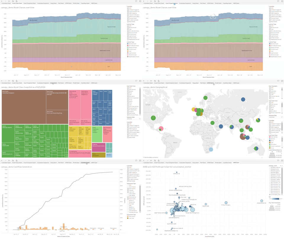
To maximize the benefits of Canopy we have started to send weekly Insights emails. These emails provide you with additional views on the portfolio (examples of the reports are included in the giphy).
Details of insights:
- Fund Fee vs IRR
- Canopy Cashflow Generated Dashboard
- Geographical Asset Allocation Peer Comparison Dashboard
- IRR vs Profit (USD) Dashboard
- Currency Exposure Over Time Dashboard
- Bond Ratings vs IRR Dashboard
- Fund Performance (IRR) by Investment Strategy
- Sharpe Ratio v/s Returns
- Market Value by Geographical Concentration Peer Comparison Dashboard
- Equity Performance by XIRR Dashboard
- Bond Performance by XIRR Dashboard
- Fund Performance by XIRR Dashboard
- Asset Overview Dashboard
- US and China Portfolio Performance Focus Dashboard
- Currency (CCY) Exposure - Equities
- Currency (CCY) Exposure - Bonds
- Geographical & Asset Allocation Peer Comparison Dashboard
- Performance - Custodian Equity Performance
- Overall Asset Overview Dashboard
- Total Cashflow Generated Dashboard
- Asset Allocation Change in 2018 Dashboard
- Volatility v/s Annual Returns
- Portfolio ESG Allocation
- DM Bonds Performance Comparison Dashboard
- DM Equities Performance Comparison Dashboard
- EM Bonds Performance Comparison Dashboard
- Geography Concentration by Market Value
